Scotopic Sensitivity
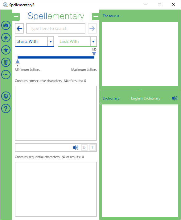
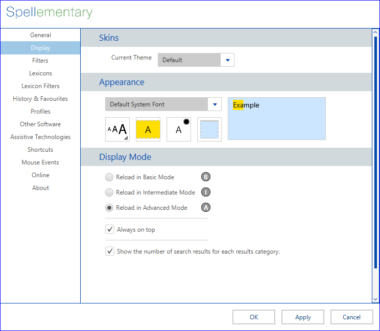
Everyone is different and the way in which someone experiences, or perceives, things can be quite contrasting to that of someone else. Whilst some things can be preferential, others, including font adjustments, can be an essential necessity. With this in-mind, Spellementary offers a lot of customisation to the interface, including fonts and colours.
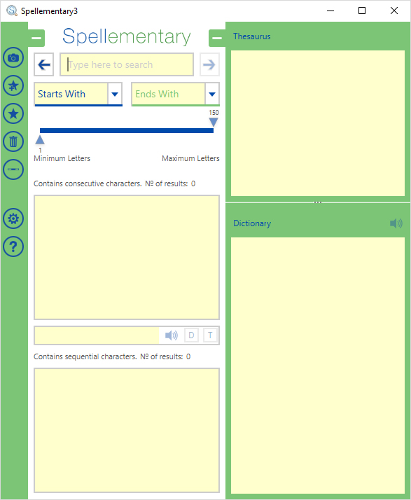
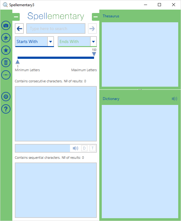
The Spellementary interpretation of Scotopic sensitivity (also has many other names) is when an individual is more sensitive to light and contrast, particularly when reading. Having black text against a white background can cause an individual to experience “odd” sensations and make it more difficult to focus. In extreme cases, it can aid bringing on headaches and migraines.
Spellementary allows the adjustments of typeface and both its colour and size as well as the letter selection and background colour. With all these adjustments, it allows each user to have a personalised and individual experience to suit both their preferences and needs.


